
Reading the Map
Hexagons
The map divides the ground into hexagons. When zoomed out, each hexagon covers a large area, roughly the size of a district. As you zoom in, the hexagons automatically subdivide into smaller areas, down to roughly two city blocks. A badge at the bottom of the map always shows the current level of detail.
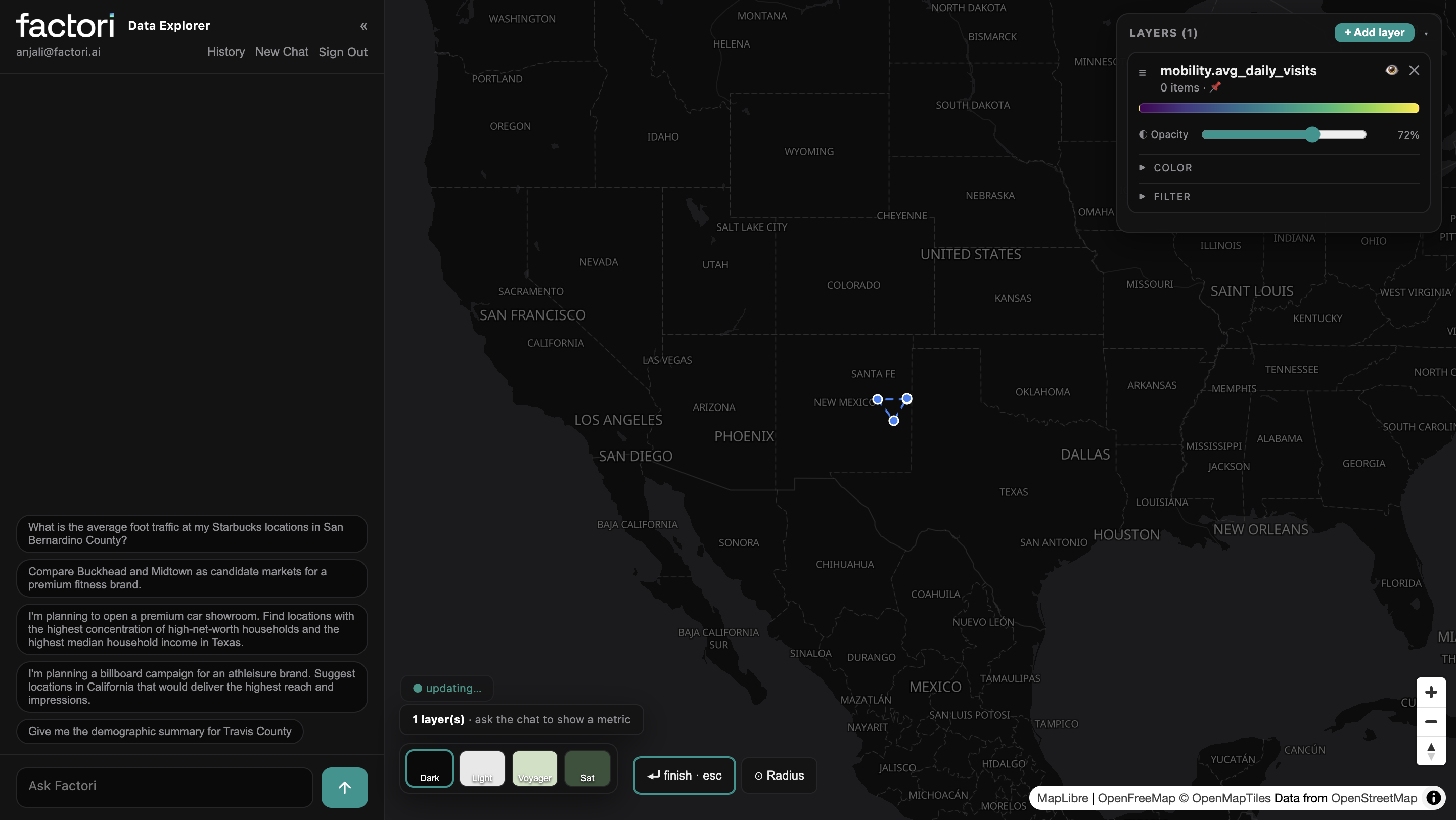
Colors
Colour shows intensity, from low to high, using a purple-to-yellow scale:
- Deep purple - Lowest values in view
- Teal / green - Middle of the range
- Bright yellow- Highest values in view
Black or empty hexagons mean there's little or no data there, such as open countryside.
Colors are always relative to what's currently on screen. Yellow means "highest in this view," not a fixed number. Zoom or pan, and the scale rebalances to the new area.
Clicking a hexagon
Click any hexagon to open an insights panel: movement, resident profile, nearby places, and spending for that spot. It's the fastest way to go from "where" to "why."
Reading the Index
Foot traffic and spending are shown as an Index, not raw counts.
→ 100 = average for the area in view
→ 220 = 2.2x the average
→ 50 = half the average
The comparison baseline always appears next to the number. A Footfall Index of 47 means that spot gets about half the foot traffic of a typical hexagon in its county. A nearby Index of 196 means roughly double the typical spot.
Movement and spend data come from sampled panels. An index cancels out sampling effects, so any two places, or any two days, are directly comparable.
Legend
The legend sits at the bottom left and describes the top layer's colors and value ranges. Bands are sized so roughly equal numbers of hexagons fall into each color, spreading detail across the map instead of letting one extreme value dominate.
Read it top to bottom, lowest to highest. Collapse it with the minus button if it's in your way.
Map themes
Four backdrop styles sit at the bottom of the map: Dark, Light, Voyager, and Satellite. They change only the background, never your data.
→ Dark — best for presentations
→ Light — best for printing or report screenshots
→ Satellite — best for seeing buildings under your data
Why one brand shows so many categories
A single store is rarely just one place. A Walmart Supercenter, for example, can include a pharmacy, garden center, optician, bakery, photo shop and each is listed as a separate place at the same address. That’s why a brand’s total place count can be higher than its number of physical buildings: it includes in-store departments and services. The layer card breaks these down by category, from most to least common, with an “Other” group covering the long tail.
A total of 9,271 counts every listed place across the brand’s stores and departments. The number of distinct physical sites is smaller.
Both numbers matter: one shows the full footprint of listed places; the other shows the brand’s physical reach.
Filtering to what matters
Each category appears as a chip in the layer card.
Click a chip to strike it out and hide those markers instantly; click again to bring them back.
→ Hide "Pharmacy" and "Garden Center" to see only core department-store locations
→ Keep only "Pharmacy" to map a brand's pharmacy footprint alone
→ Toggle the "Other" chip to show or hide the entire long tail at once
The map refreshes live counts as you zoom and pan, so the layer card always reflects what's currently in view, not a fixed sample.
Managing layers
Every metric you add becomes a layer in the panel on the top right. Stack several at once:
| Control | What it does |
|---|---|
| Eye icon | Show or hide a layer without deleting it |
| ✕ | Remove the layer |
| Opacity | Fade a layer to see what's beneath it |
| Color | Switch a layer's color scheme |
| Filter | Narrow a layer to a value range |
| Drag handle (≡) | Reorder which layer sits on top |
A common combination: put a heatmap (like income) underneath, place markers (like your stores) on top, then lower the heatmap's opacity to see your locations sitting on the income landscape.
FAQ
- What geographies does Data Explorer cover?
Data Explorer currently covers California, Texas, and Georgia, with more geographies coming soon. - Is the data privacy-safe?
Yes. Everything is aggregated to areas. There is no individual person, card, or transaction anywhere in the platform. - Are sensitive locations handled differently?
Yes. Places such as clinics, places of worship, schools and government sites appear on the map, but their visitor and demographic detail is withheld. - What's the difference between the Index and a plain number? Foot traffic and spend are shown as an Index (100 = average) because they come from sampled panels, and an index cancels out sampling effects for fair comparison. Population, dwell time, average ticket, and place counts are shown as plain numbers because they don't need that adjustment. See "Reading the Map" above for the full breakdown.
- Can I compare two areas side by side?
Yes, ask directly, e.g., "Compare two neighborhoods as candidate markets for a fitness brand," or build the same layer for each area manually and toggle between them.
Updated 22 days ago